Table of Contents
ToggleGold letter wall decor has become one of the most accessible ways to add personality and polish to any room without major construction or commitment. Whether spelling out a family name in the entryway, adding inspirational words to a bedroom, or creating a branded look in a home office, these metallic accents deliver visual weight and customization that few other wall treatments can match. Unlike paint or wallpaper, letter decor is reversible, reconfigurable, and surprisingly forgiving for first-time installers. This guide walks through material choices, placement strategies, and installation techniques to help homeowners get professional-looking results without hiring a designer.
Key Takeaways
- Gold letter wall decor offers a reversible, customizable alternative to paint and wallpaper that adds personality without permanent damage, making it ideal for renters and homeowners alike.
- Choose between metal letters (durable and lustrous) or plastic letters (lightweight and affordable) based on your room type, humidity levels, and installation method.
- Proper placement and sizing are critical—aim for letter heights of 8–24 inches on focal walls and mount above furniture or headboards at eye level (60–66 inches) for maximum visual impact.
- Adhesive-backed letters work best on smooth surfaces like drywall and tile, while screw-mounted options are necessary for heavy metal pieces and high-safety areas like above cribs or seating.
- Always use a paper template before final installation to test spacing, alignment, and positioning, and prep walls with isopropyl alcohol to ensure adhesive bonds properly.
- Gold letter wall decor complements warm metallics, brushed finishes, and modern interiors, bridging the gap between functional signage and sculptural art to reflect occupants’ personalities.
Why Gold Letter Wall Decor Is Trending in Modern Interiors
Gold finishes have regained traction in residential design as homeowners move away from the all-gray palette that dominated the 2010s. Warm metallics, especially brushed gold, antique brass, and champagne tones, add depth without the coldness of chrome or the industrial edge of matte black.
Letter decor occupies a sweet spot between functional signage and sculptural art. It personalizes a space more directly than abstract prints but avoids the cluttered feel of gallery walls packed with frames. For renters and homeowners alike, adhesive-backed letters offer a no-drill solution that won’t forfeit a security deposit or leave permanent damage.
The trend also aligns with the rise of personalized interiors. Names, initials, and motivational words turn a generic builder-grade room into something that reflects the occupants. This type of decor scales well, from a single oversized initial in a nursery to a full surname spanning a living room wall, making it adaptable across budgets and skill levels.
Popular Types of Gold Letter Wall Decor for Every Room
Metal vs. Plastic Gold Letters
Metal letters (typically aluminum, steel, or brass-plated composite) offer durability and a genuine metallic luster that catches light differently throughout the day. Brushed or hammered finishes hide fingerprints better than high-polish options. Expect thicknesses from 1/8 inch to 1/2 inch, with heavier gauges requiring anchored mounting rather than adhesive alone. Metal is ideal for high-traffic areas, exterior use (if powder-coated), and spaces where the decor needs to hold up to humidity, like bathrooms or laundry rooms.
Plastic or resin letters coated in metallic paint or vinyl film are lighter, less expensive, and easier to cut or drill if customization is needed. Quality varies widely, look for UV-resistant finishes if the letters will be near windows, as cheaper gold spray coatings can fade or yellow. Plastic letters work well for temporary installations, kids’ rooms, or anyone testing a layout before committing to pricier materials. They’re also the go-to for anyone mounting on drywall without access to studs, since the reduced weight minimizes pull-out risk.
Adhesive, Mounted, and Freestanding Options
Adhesive-backed letters use double-sided foam tape or peel-and-stick backing. They’re renter-friendly and require no tools beyond a level and a tape measure. The catch: wall texture matters. Smooth drywall, painted wood, and tile accept adhesive well: heavily textured surfaces or freshly painted walls (less than 30 days cured) may not hold long-term. For plaster or textured drywall, consider roughing up the contact area lightly with fine-grit sandpaper and wiping with isopropyl alcohol before application.
Screw-mounted or stud-anchored letters provide the most secure installation, especially for metal pieces over 12 inches tall. Pre-drilled mounting holes are standard on larger metal letters. Use a stud finder to locate framing, or install drywall anchors rated for the letter’s weight, typically toggle bolts or screw-in plastic anchors rated for 20–50 lbs. This method is non-negotiable for letters installed above seating areas or cribs, where falling decor poses a safety risk.
Freestanding letters lean on mantels, shelves, or console tables. They’re the easiest to reposition and require zero wall prep, but they do consume horizontal real estate. Pair them with books, picture frames, or small plants to create layered vignettes. This approach works especially well in rooms where wall mounting isn’t practical, like spaces with brick, stone, or paneling that’s difficult to penetrate without specialty bits.
How to Choose the Perfect Gold Letters for Your Space
Start by measuring the wall area available. A common mistake is choosing letters that are too small for the space, what looks substantial in a product photo often disappears on a 10-foot wall. As a baseline, aim for letter heights between 8 and 24 inches for focal walls, and 4 to 8 inches for accent shelving or narrow hallways.
Font style should complement the room’s existing design language. Serif fonts (with small decorative strokes at letter edges) lean traditional and formal, appropriate for dining rooms, libraries, or classic entryways. Sans-serif fonts read modern and clean, fitting well in minimalist spaces, home offices, or contemporary kitchens. Script or cursive fonts add softness and work in bedrooms, nurseries, or anywhere a romantic or casual vibe is desired. Avoid overly ornate fonts if the letters will be backlit or viewed from a distance: legibility drops fast.
Finish tone matters more than many DIYers realize. Brushed gold has a matte, subdued glow that pairs with warm wood tones and neutral palettes. Polished or shiny gold makes a bolder statement but can read dated if the rest of the room skews traditional, reserve it for eclectic or maximalist interiors. Antique or aged gold (often with dark patina in recesses) bridges vintage and industrial styles, working well in loft spaces or farmhouse-inspired rooms.
Consider the letter’s profile thickness. Flat, laser-cut letters create crisp shadows and a graphic look. Dimensional letters with a 1- to 2-inch standoff from the wall add sculptural presence and work well in rooms with high ceilings or large furniture pieces that need visual balance.
Creative Placement Ideas for Maximum Impact
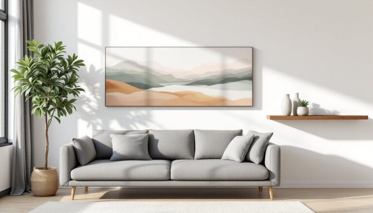
Above the headboard is the most popular placement for bedroom letter decor, think family names, initials, or single words like “Dream” or “Rest.” Center the arrangement on the bed, not the wall, especially if the bed is offset. Leave 6 to 12 inches of clearance above the headboard to avoid a cramped look.
In the entryway or foyer, a surname or welcome message creates immediate personalization. Mount letters at eye level (60 to 66 inches from the floor to the letter’s midpoint), which is the standard gallery height used in museums and design showrooms. If the entryway has a console table, consider freestanding letters that echo the family name or monogram displayed on the wall above.
Home offices benefit from motivational or branded text. Words like “Focus,” “Create,” or a business name establish purpose in the space. For those setting up dedicated fitness areas, gold letters spelling “Train,” “Grind,” or personal mantras keep the space feeling intentional rather than improvised.
Kitchens and dining rooms can handle playful or food-related words, “Gather,” “Feast,” “Cheers”, but avoid placing letters directly above cooking surfaces where grease and heat can degrade adhesives or finishes. A blank wall adjacent to the dining table or above open shelving is safer and easier to clean.
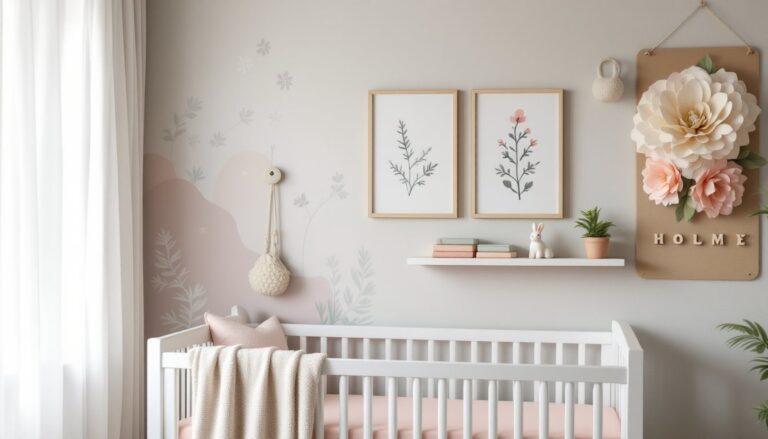
Nurseries and kids’ rooms are prime real estate for names or initials. Mount letters out of reach (at least 3 feet above the crib mattress) to prevent curious hands from pulling them down. Use screw mounts or heavy-duty adhesive rated for the letter weight, and skip anything with small detachable parts that pose choking hazards.
DIY Installation Tips for Gold Letter Wall Decor
Safety first: Wear safety glasses when drilling into drywall or masonry, especially overhead. If working on a ladder, have a second person stabilize it or hand up tools and materials.
Materials and tools you’ll need:
- Tape measure
- Pencil
- Level (a laser level speeds up alignment for multi-letter installations)
- Stud finder (for screw-mount letters)
- Drill and appropriate bits (masonry bit for brick/concrete, standard twist bit for wood studs)
- Drywall anchors (if not mounting to studs)
- Isopropyl alcohol and lint-free cloth (for surface prep on adhesive installs)
- Painter’s tape or removable masking tape (for layout mock-ups)
Step-by-step installation:
- Plan the layout on the floor first. Arrange letters with consistent spacing, typically 1/2 inch to 2 inches between characters, depending on letter size and font. Measure the overall width and height of the final arrangement.
- Mark a level reference line on the wall. Use a long level or laser level to draw a light pencil line where the bottom (or center) of the letters will align. This prevents the dreaded uphill creep that happens when eyeballing each letter individually.
- Create a paper template. Trace each letter onto painter’s paper or newspaper, cut out the shapes, and tape them to the wall. Step back and evaluate from multiple angles and distances. Adjust spacing and height before committing to adhesive or holes.
- Prep the wall surface. Wipe down the mounting area with isopropyl alcohol to remove dust, oils, and residues. Let it dry completely, at least 5 minutes. For textured walls, lightly sand high spots if using adhesive, then clean again.
- Install one letter at a time. For adhesive letters, peel backing slowly and press firmly for 30 seconds, applying even pressure across the entire surface. For screw-mounted letters, drill pilot holes slightly smaller than the screw diameter, insert anchors if needed, then attach letters with screws. Don’t overtighten, metal letters can warp, and plastic can crack.
- Check alignment after every 2–3 letters. Hold the level against the bottoms or tops of installed letters to catch drift early. Small adjustments are easier mid-project than after the whole word is up.
Common mistakes to avoid:
- Skipping the template step. What looks centered in your head rarely is. Mock-ups catch spacing errors before they’re permanent.
- Mounting on fresh paint. Paint needs 30 days to fully cure before adhesive will bond reliably. If you can’t wait, use screw mounts or freestanding letters.
- Ignoring wall material. Brick, concrete, and tile require masonry anchors and bits. Drywall over metal studs needs different anchors than wood studs. Identify your wall type before buying hardware.
- Overloading adhesive. Even heavy-duty foam tape has limits, usually 5 to 10 lbs depending on surface texture and temperature. For anything heavier, switch to mechanical fasteners.
For renters or anyone hesitant about wall damage, removable adhesive strips designed for picture hanging can work for lightweight letters under 2 lbs. Follow the manufacturer’s instructions for surface prep and removal to avoid paint pull.
If letters will be installed on wood paneling, shiplap, or beadboard, locate the studs behind the panels for the strongest hold. Surface-mounting to thin paneling alone may not support heavier metal letters, especially in rooms with vibration from doors closing or foot traffic.